
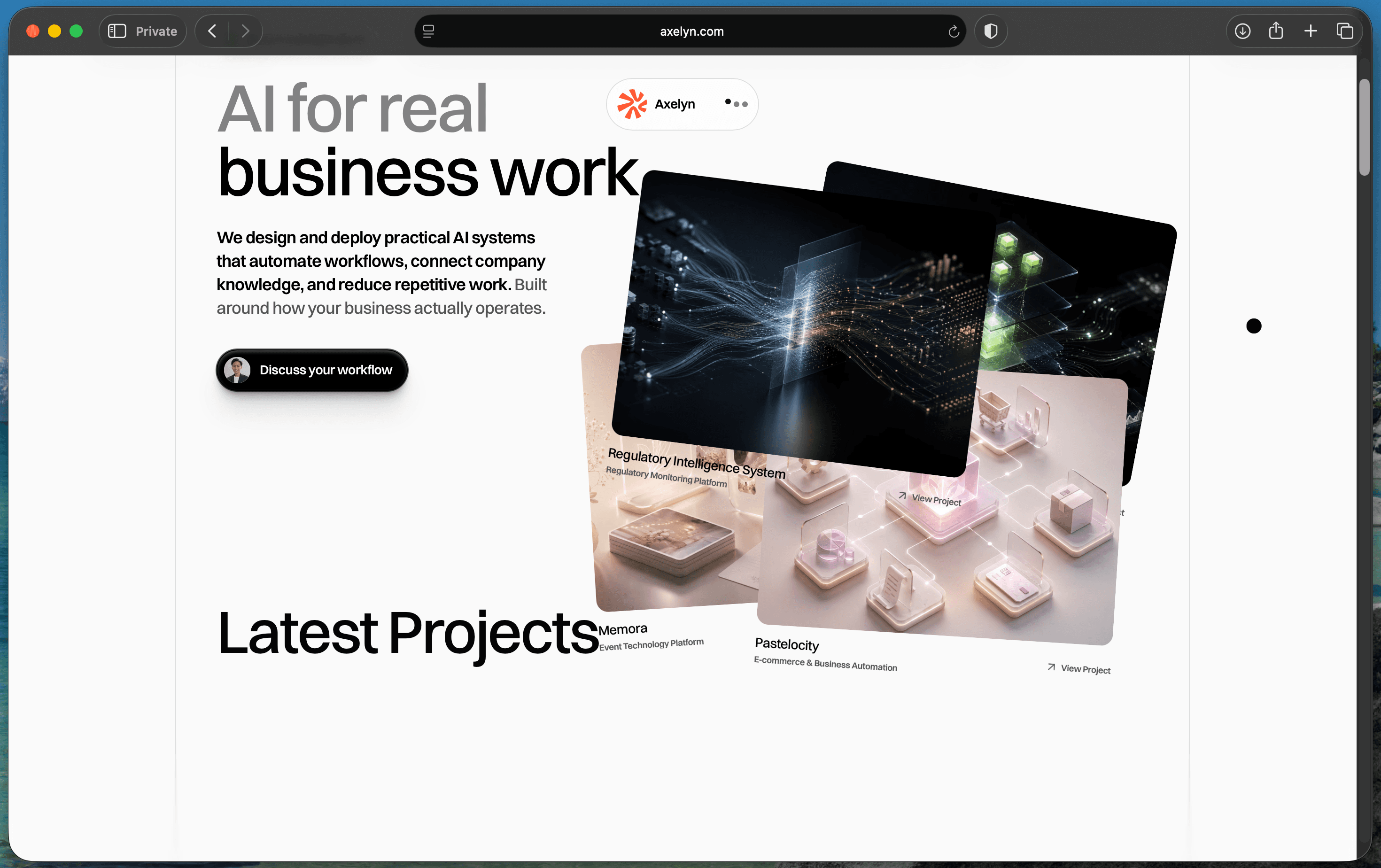
The studio had outgrown its story
Axelyn already had evidence of production software, data pipelines, integrations and AI systems. The old story concentrated that work into a narrow “AI systems” proposition. It explained the engineering, but it left creative direction, interface craft and full-product delivery in the background.
This project reframes Axelyn around the work clients can commission: digital products, brand and interactive experiences, and connected systems. It also makes the commercial path explicit through five engagement packages with defined responsibilities and boundaries.
One idea connects the identity
The new direction treats creative and technical work as one continuous signal. A responsive field moves between ideas, interfaces and systems in the opening canvas. Axelyn’s four-part orange symbol anchors that motion in the established identity.
The visual system keeps the rest controlled: mineral white, dense black, Axelyn orange, two type families and hard editorial divisions. Motion has a job—to show elements connecting and resolving, rather than adding ornament.
The implementation is part of the case
Astro renders the content-led pages. Work lives in typed MDX collections so each case study can grow independently. React is reserved for the hero interaction, while GSAP and ScrollTrigger handle the page’s entrance and scroll sequences. The interface respects keyboard input and reduced-motion preferences.
The release is designed as a test. Its next evidence will come from qualified conversations, completed enquiries, paid engagements and measured delivery—not from invented claims at launch.